New year, new logo!
Here is the very first Grommet logo, created by Aaron Belyea/Alphabet Arm:

Here was our 2013 update to that logo, which coincided with a company name change (logo also by Aaron):
![]()
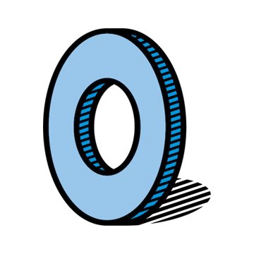
Here is the new one (created by Grommet designer Marie-Eve Tremblay, with a typographical assist from Aaron, for old time’s sake):
![]()
If you are not into logos, this is a really boring blog post. You can politely shut your browser tab. (But I wonder why you even opened it.)
For everyone else: the new logo is not radical–it’s an evolution. But it is a powerful response to the goals we set in place for it:
- Modernize. I LOVED the hand-drawn rough quality of our old logos. But too many casual observers imputed from the logo that we launch handmade products. We do–but very, very few. The vast majority of Grommets are manufactured and many represent cutting edge technologies. The new logo embraces the full spectrum of Grommets better.
- Functionality. The old logo was too vertical and in a mobile driven world we needed a logo that could be more horizontal and shrink down legibly. (Who wants a logo eating up 15% of their screen height?) The old “sweat marks” and horizontal lines created the bigger logo mass but were essential to anchoring the round blue “grommet.” I.e. it was not shrinkable. Without the additional marks, it looked naked and vulnerable and at risk of tipping over. The new bolder hard-edged shadow anchors the image without taking up so much space.
I am probably alone on this front, but I embrace the little blue logo character like a living being. I see it representing each and every Maker. I see it representing our company as a humble and hardworking assist to our Makers (like a real-life hardware store grommet.)
I loved the old logo’s sweat marks because they connected to the hard work of our entrepreneurs. But I also love the stronger, sharper blue grommet because this image represents where our Makers strive to be: boldly claiming their full opportunity, place in the market, and making their dent in the universe. It is our collective job to get them there, and the new logo captures that vision.


6 Responses to “New year, new logo!”
I like it! That little grommet image says Superheros to me..like your company and the makers.
So funny you say that. For a service project we did this summer one of our designers illustrated a little red cape flowing behind the blue grommet. I loved it.
HA! I thought I was seeing things when I was on the site today. Lovely evolution! 🙂
You have a good eye Margo!
“you can politely shut your browser tab” – just awesome.
I like both the emotional and rational thinking that went into this new design – it feels like The Grommet is holding up those Makers – how powerful.
Thanks Melissa. Logos are so hard and they do have to work on both the emotional and rational levels you identified.